Real-Time Monitoring 🖥️
PyRun offers real-time insights into your workload performance, helping you monitor CPU, disk, network, and memory metrics as your tasks execute. This guide will walk you through each section of the real-time monitoring dashboard, enabling you to understand and optimize your workloads effectively.
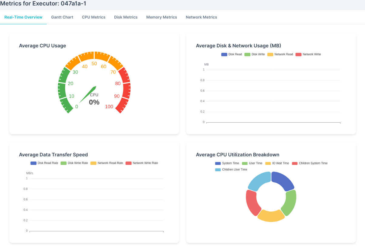
Real-Time Overview Tab
The Real-Time Overview tab provides a summary of key metrics across your workload. Here’s what each chart represents:
1. Average CPU Usage
This gauge-style chart shows the real-time CPU usage across your workload. The color-coded scale helps you quickly assess CPU intensity:
- Green indicates light usage, suitable for low-demand workloads.
- Yellow shows moderate usage, suggesting some load.
- Red indicates high CPU usage, signaling intensive processing that may require attention.
2. Average Disk & Network Usage (MB)
This chart gives you a snapshot of disk and network data usage in megabytes (MB):
Disk ReadandDisk Writeindicate storage access levels.Network ReadandNetwork Writeshow data transfer rates over the network. This chart helps you identify potential bottlenecks in data access or network performance.
3. Average Data Transfer Speed
This chart tracks the speed of data transfer, covering both disk and network read/write rates:
Disk Read RateandDisk Write RateNetwork Read RateandNetwork Write RateThese metrics are useful for evaluating how quickly data is accessed, supporting optimal workload performance.
4. Average CPU Utilization Breakdown
The CPU utilization breakdown shows where CPU time is being spent, divided into:
System Time,User Time,IO Wait Time,Children System Time, andChildren User TimeThis donut chart helps you see which processes are consuming CPU resources, enabling you to adjust workloads as needed.
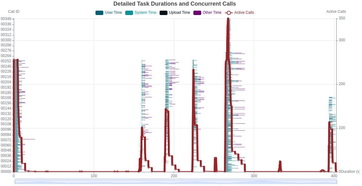
Gantt Chart Tab
The Gantt Chart tab gives a detailed view of task durations and concurrent calls in real time. This chart helps you visualize:
- How long each task is taking (
User Time,System Time,Upload Time,Other Time) - The number of
Active Callsat any point, showing peaks in task concurrency Use this view to understand task timing and spot areas where optimization could reduce wait times or processing delays.
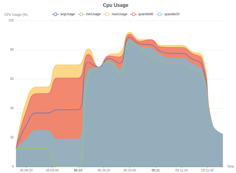
CPU Usage Tab
In the CPU Metrics tab, you can track detailed CPU usage over time with these key metrics:
avgUsageprovides the average CPU usage.minUsageandmaxUsageshow the usage range.quantile80andquantile20represent higher and lower percentiles for finer-grained insights. This helps you analyze CPU load variability and spot peaks or lulls that might affect workload performance.
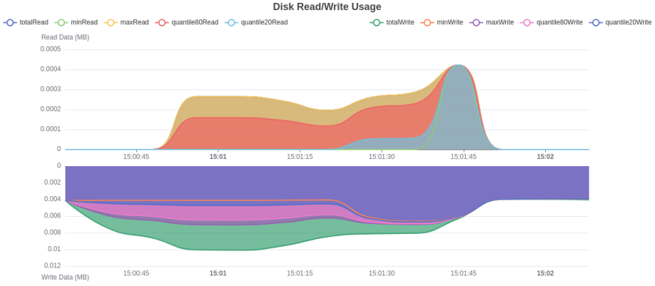
Disk Read/Write Usage Tab
The Disk Metrics tab offers insights into the volume of data being read and written on disk. Key metrics include:
totalReadandtotalWritefor total data accessed.minReadandmaxReadfor observing data access peaks and lows.quantile80Readandquantile20Readfor percentile-based analysis. Monitoring disk usage is essential for data-intensive workloads, helping you avoid I/O bottlenecks.
Disk Read/Write Rate Tab
The Disk Read/Write Rate chart shows how fast data is read from and written to disk in MB/s:
totalReadandtotalWriteshow aggregate data transfer.minReadandmaxReadindicate the speed range.quantile80Readandquantile20Readhelp you understand typical vs. peak rates. Use this to check if data access speeds meet your workload’s needs or if storage limits are being reached.
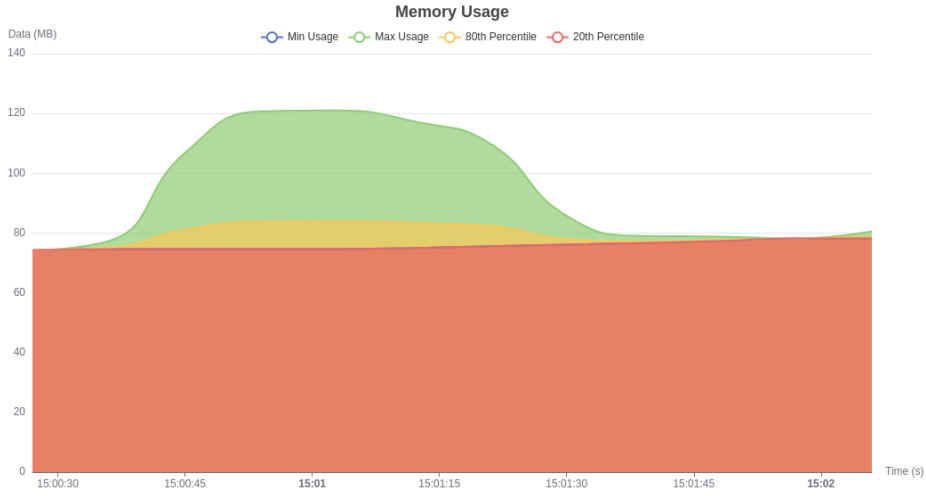
Memory Usage Tab
The Memory Metrics tab displays your workload’s memory usage in real time:
Min UsageandMax Usageprovide the range of memory used.80th Percentileand20th Percentileshow memory demand patterns. Tracking memory usage helps you ensure workloads are not exceeding memory capacity, which could lead to slowdowns or failures.
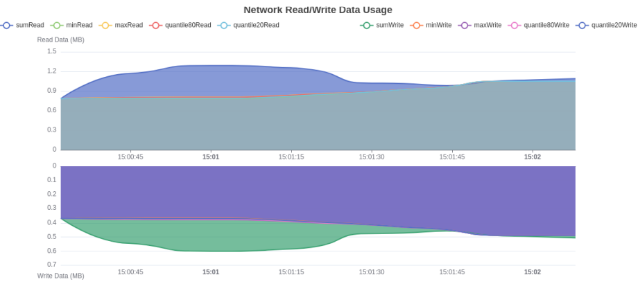
Network Read/Write Data Usage Tab
In Network Metrics, the Network Read/Write Data Usage chart tracks the amount of data moving across the network:
sumReadandsumWriterepresent total network data read and written.minReadandmaxReadshow minimum and maximum data usage.quantile80Readandquantile20Readoffer percentile-based insights. This chart helps you identify if network constraints are affecting workload efficiency, especially during high-demand periods.
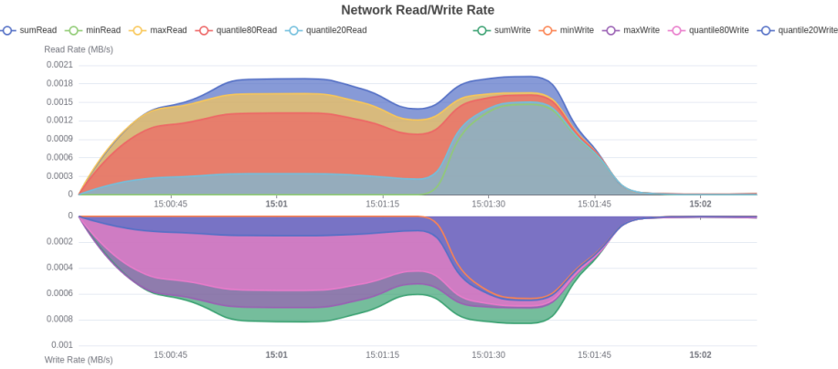
Network Rate Tab
Finally, the Network Rate chart monitors the read and write speed of network data in MB/s:
sumReadandsumWriteshow total data transfer rates.minReadandmaxReadprovide the speed range.quantile80Readandquantile20Readallow you to observe typical rates versus peak usage. This information is essential for workloads with high data transfer needs, ensuring your network can handle the demand.
PyRun's real-time monitoring dashboard provides the insights you need to optimize your workload performance, helping you quickly spot bottlenecks and adjust resources to maintain efficiency.